The Chalet Oranges
When Chalet Artistic Glass opened in Cornwall in September of 1962, their glass creations were only offered in three colours – aqua, amber, and olive. However, Chalet Maestro Buno Panizzon told me during an interview that, only months later, by mid 1963 when he had joined Chalet, a fourth colour had already been added to production – tangerine. It is not surprising that Chalet chose to add orange so quickly to their colour kaleidoscope as this colour has traditionally been a symbol of optimism, happiness, enthusiasm, and youthful connections. Orange Chalet pieces remain a favourite for today’s collectors.

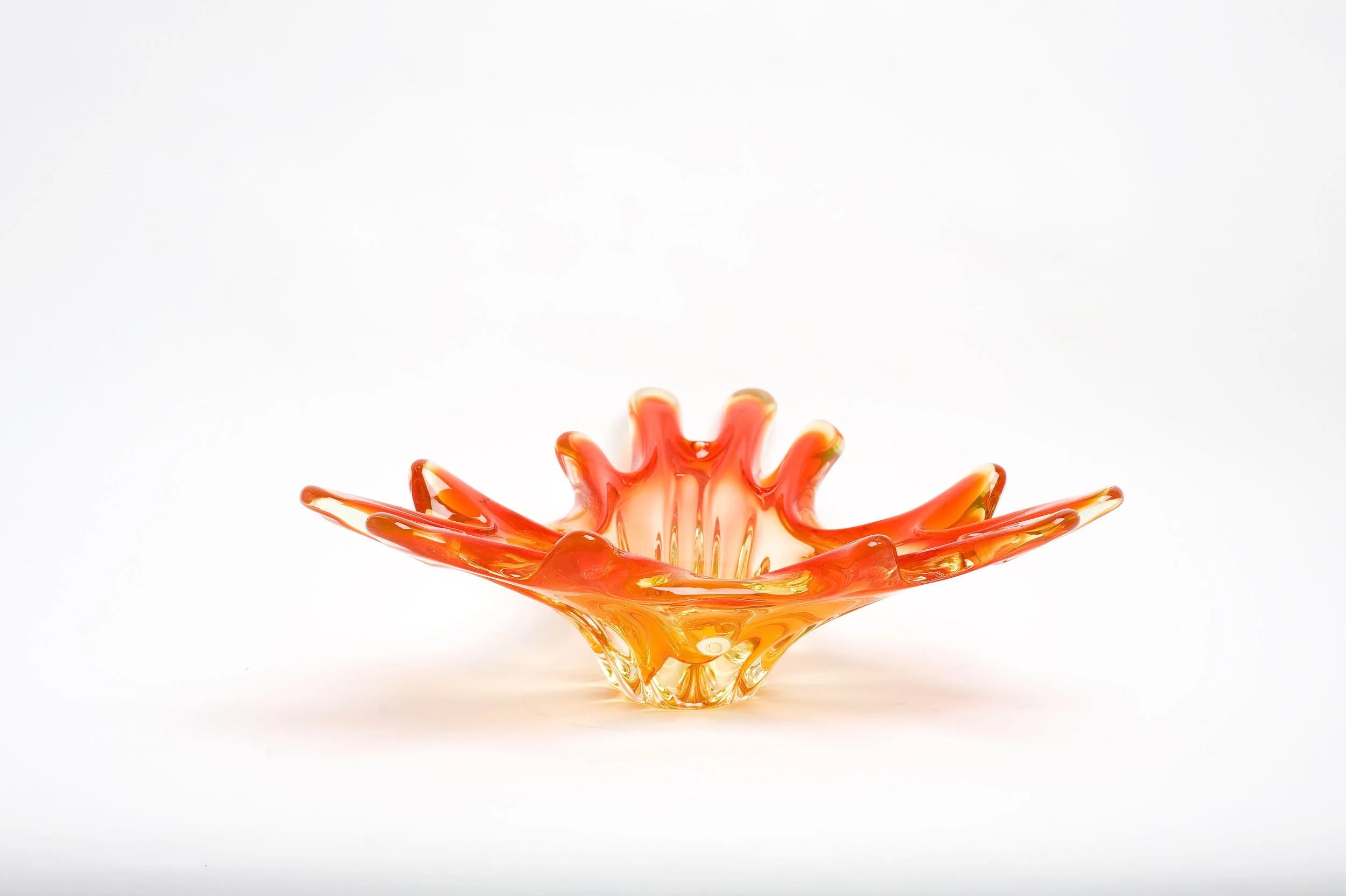
3 of my personal “tangerine” favourites.

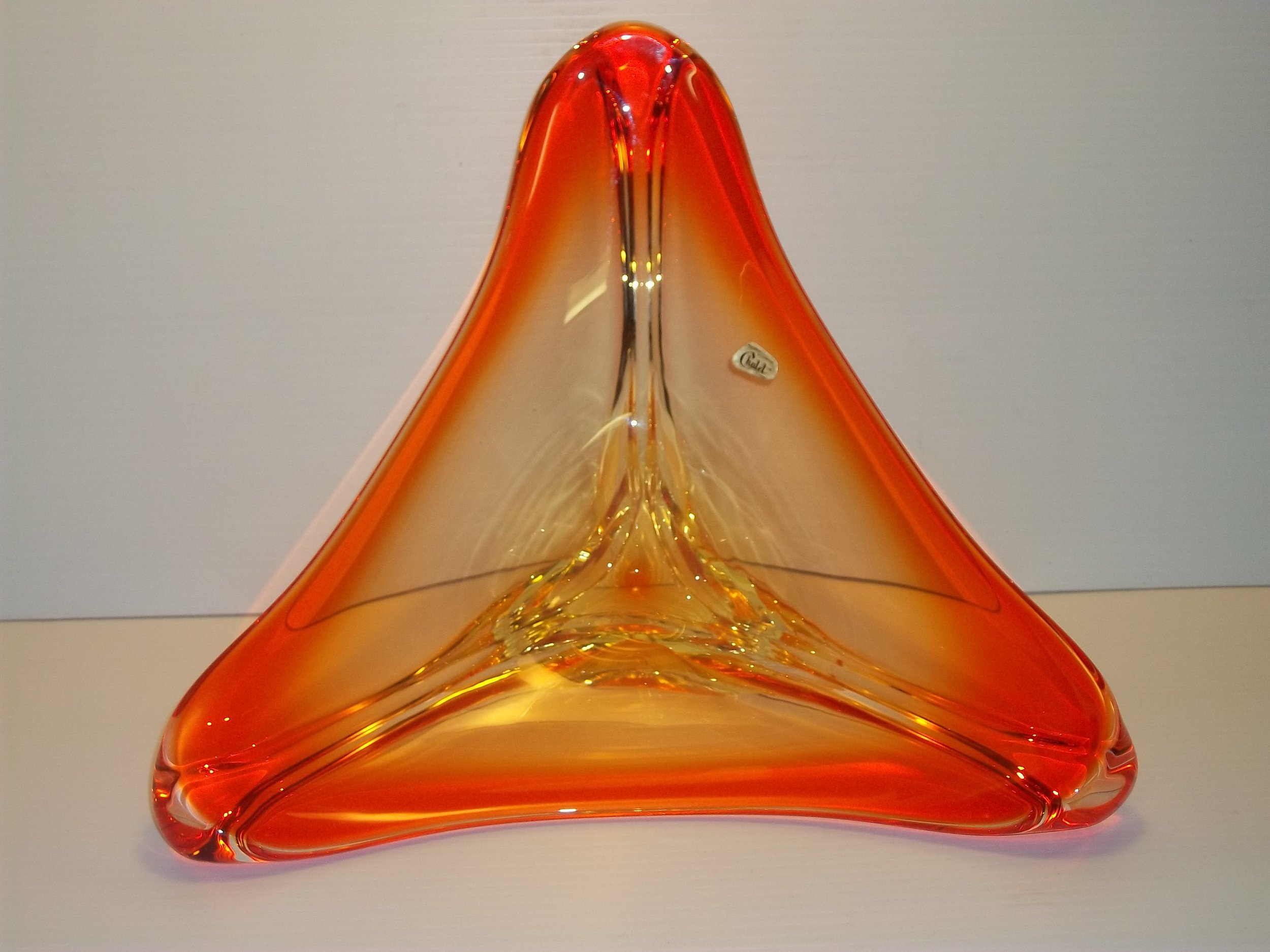
Another favourite. However, not “tangerine” in tone but a much more vibrant shade of orange. The colour saturation and intensity of orange in this “fingertip” centerpiece is fabulous. Its colour takes me back to the Laura Secord orange kiddy pops of my childhood! Although, I must admit that the butterscotch were my favourite.


At left, the 1962 Chalet “Items Available” catalog sheet. On right, a December 17, 1964 advertisement from the Kitchener Waterloo Record (a division of the Postmedia Network) from Chalet retailer “Smucks”. This “china and gift store” was promoting Chalet centerpieces and ashtrays. The 1964 prices for centerpieces were $12.00 and $14.00. In 2024, these prices translate to $117.64 and $137.25. 1964 prices for the ashtrays they carried were $8.00 and $9.50. These would be priced today at $78.43 and $93.13.
How did Chalet use orange?
Chalet used orange in 2-tones, solids, “ribbons” of colour for some styled pieces and it was a colour used in the inclusions for their paperweights as well. Interestingly, it was not often used to “colour rim” pieces as we see cranberry, amber, olive and blue used so frequently.
Some of the more common 2-tone combinations found using orange:

Vase at right from the collection of 50 Shader Cindy Bishop Laughlin.
A stunning 2-tone set of the Chalet “molar” style of candleholders:

From the collection of 50 Shades member Malla Birns.
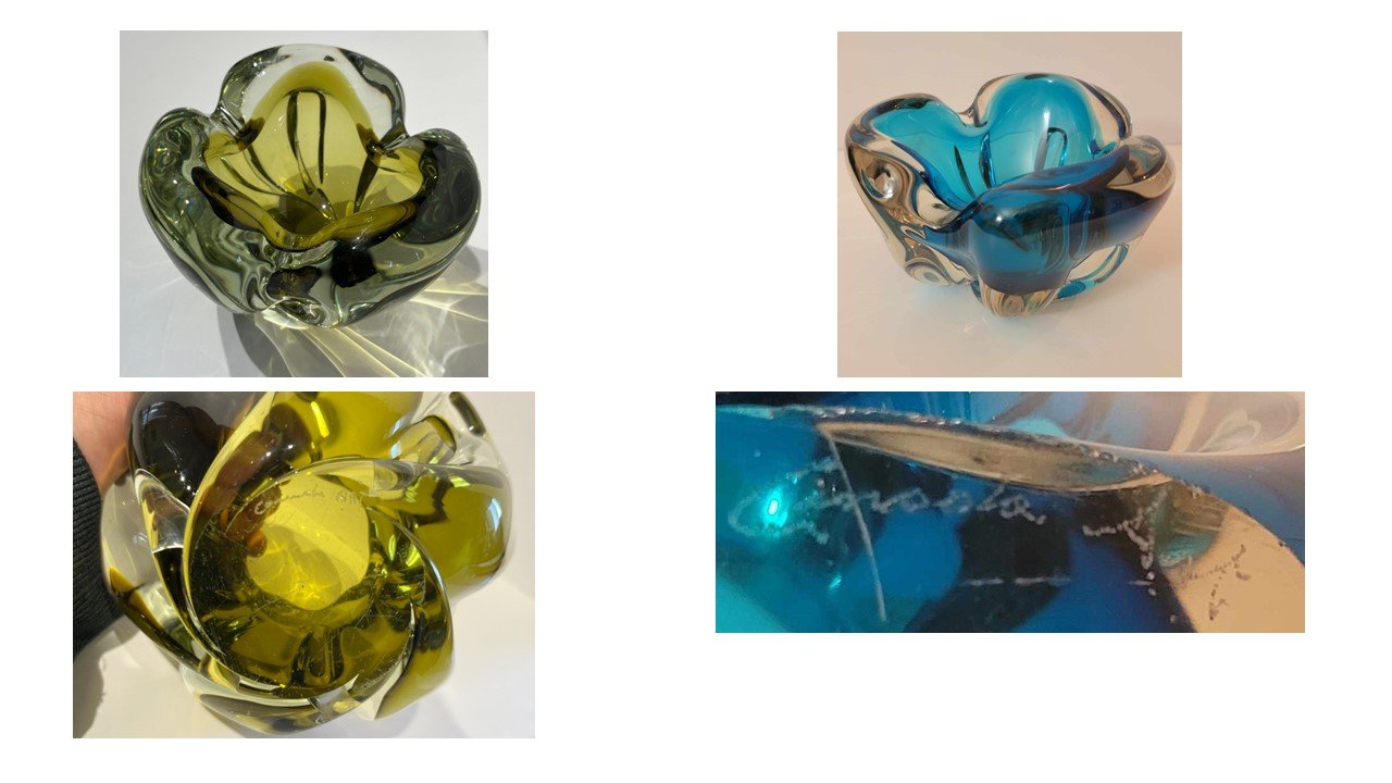
A one-of-a-kind multi-tone. Both in colour combination and vase style. How many shades of orange do you see?

This completely mouth-blown vase was created by Chalet owner, chemist, and Maestro Sergio Pagnin with fellow Chalet founder and owner Maestro Luigi Tedesco. . I am very fortunate to have this in my collection. I purchased it from the family of Chalet artist Giovanni Voltalina who watched it being made. He was then asked if he would like it.
Placed as a “ribbon” of colour:

Very commonly found as one of the colours in the inclusions in the Chalet paperweights:

Orange is always one of the colours found in the Chalet “DNA spiral” style of Chalet paperweight.

Paperweight in top middle from the collection of the Cornwall Community Museum. Unique in that it has more than the typical 3 spirals with 2 colours. This particular piece has 5 colours and 5 spirals. Photograph courtesy of curator Don Smith. The paperweight to its right from the collection of 50 Shades member Geoffrey Chown. The “confetti” paperweight in bottom right corner is from the collection of 50 Shades member Jonathon Tremblay. The other 3 pieces, an iris (bottom left) and two “sea anemone” paperweights are from the collection of Deborah Patterson. As is the standalone “DNA” paperweight shown above.
Not as typically used as a “colour rimming” as were cranberry and the colours amber, olive and blue. However, you will note a “swan” centerpiece shown below that has this colour rimming. It is not a piece containing urnium.

To date, we have found few Chalet pieces “rimmed” in orange. Shown in this gallery are the typical colours used. Basket rimmed in blue (at right) from the collection of 50 Shades member Dwain Robertson.
The tones and colour placement show an incredible variation and range. You will note this throughout the examples used in this article and video. In addition, I have pulled 4 pieces to highlight these points.

These crystal twists and apple ashtrays are excellent examples of the variation in colour and colour placement found between the same forms. Remember, variation is the norm – not the exception. Chalet colours were hand mixed and measured and then the pieces were hand worked so no two pieces will ever be identical. Colour mixes were also affected by environmental factors such as the age of the mix and the age and cleaning of the crucibles. Apple ashtray at bottom right from the incredible collection of 50 Shades’ Cindy Bishop Laughlin.
What forms do we find in orange? What forms do we not find in orange?
Orange was used in both the hand-blown and hand-molded lines. In the hand-blown forms, it was used in all the iconic shapes as well as in rarer, “Never say Never” and one-of a kind-pieces.
The iconic shapes of Chalet in one of its most iconic colours:

Note the variation and range of shades and saturation.
A more unusual Chalet ashtray:

Signed “Chalet Canada.” However, this shape is typically found with the hand engraved “Canada Art” Chalet branding. Shown immediately below.
Blue ashtray from the collection of 50 Shades member Gionny Gueli.
Some rarer forms in orange:

The candleholders and 6-arm stretch centerpiece in this gallery from the collection of 50 Shades member Gionny Gueli. Vase at middle right from the collection of group member Ella Hanks. 4-arm stretch from the collection of glassceramics. Set of fruit bookends owned by 50 Shades’ Pina Pina. Note the “swan” figurine (top left) as mentioned above.

Orange “tornado” style candleholders have also been found. 50 Shades member Troy Danby is lucky to own this very rare piece.
It was also used as a colour for Chalet lamps and fruit:

50 Shades member Jo Highland has paired her orange 14 inch “crystal twist” Chalet lamp with a Chalet mouth blown apple to create a charming vignette.
50 Shades member Reg Paulson knows to remember “Never say Never” when he is out hunting in the Wild.

Etched signature visible even on display.
A one-of-a-kind vase from the collection of 50 Shades member Jackie Lyn. It is also etched with the “Chalet Canada” signature.

This vase is just a “Wow” moment every time you look at it.
In the hand molded lines, orange was used in the “Canadian Heritage Glass” line. However, few have been found.

This pitcher is an exceptionally rare finding. I have only ever seen one other orange form from this line. It was a pedestal booted bowl. However, I do not have a photo of it.
Orange is occasionally found in the animal figurines and minis. These are not common finds either.

Two larger Chalet figurines. At left, another piece from 50 Shades member Cindy Bishop Loughlin. Note that the olive-green colouring in the 2-tone swan figurine at right is placed where the bird would float in the water. Exceedingly rare piece both in form and colour combination.

Both of these pieces are also very rare. Polar bear figurine from the collection of 50 Shades member Ken Brewer.
Every so often, an orange Chalet piccolo is found:

Orange Chalet “minis” are very rarely found. This wonderful little vase is another from the collection of Ella Hanks.
To date, there have been no Chalet bomboniere forms, in any style, found in orange. As shown in the examples throughout this article, orange pieces were branded with all the Chalet indicia. With the notable exception of one – there have been no orange pieces discovered with the hand engraved “Canada Art” signature.
Some of Chalet’s most sought-after pieces contain uranium oxide. Uranium, a naturally occurring element, when suitably prepared as a compound, produces a color of great vividness. First used by artisans in pottery glazes and glass. You often hear antique glass that contains uranium referred to as “Vaseline Glass.” This was a nickname given in the 1920’s to pieces that glowed as there was a perceived resemblance to petroleum jelly.
It was widely used before and for a few years after World War 1 but then banned. Supply was determined most often by catastrophic world events and after World War 2, the use of uranium in civilian productions was again allowed. As a result, during the 1950’s, there was a great boom in uranium mining in Canada. Canada remains the greatest producer of uranium in the world. It was used off and on again for civilian usage in Canada up to 1968. However, due to the associated health and environmental risks associated with uranium and disposal of its waste, in 1963, the U.S and Great Britain declared a moratorium on widespread uranium use in civilian applications. Debate in Canada regarding these same issues began in 1967 and ended in 1969 with the same moratorium. France allowed civilian use of uranium until 1980 and, some countries, like China, still allow uranium use in the production of goods such as glassware.
Chalet Artistic Glass was registered with the American government’s Nuclear Materials Management and Safeguards System because of the company’s use of depleted uranium in its glass – a fact of which the Chalet artists were unaware. Uranium is not only found in many of the orange-coloured Chalet pieces, but also in pieces of blue/green and cranberry/green. Some clear crystal rarities have surfaced as well. It can be detected under a UV light which causes the glass to fluoresce (emit visible light) green – sometimes with a brilliant radiance and sometimes weaker as pieces with a high lead content will cast less of a glow. Pieces that seem to light up with a red or orange glow instead of or sometimes along with the green glow most probably contain magnesium as well or instead of uranium. Chalet stopped using uranium, along with several other ingredients, with the Canadian government ban. The risk to the workers was not only through inhalation and ingestion but through dermal contact and injury – something to which glassblowers are prone.
“Fire” Chalet pieces, one of the two coloured combinations with uranium in the mix, are quite frequently found. And very highly prized.
From the collection of 50 Shades member Raymond Caron.


The uranium stretch centerpiece at right lights up the collection of 50 Shader Brad McGillivray. One could call the colour placement here “rimming.”
The “Fire” uranium shown with the second uranium coloured combination – the Chalet “Ice” uranium:


I saved some of the best for last – house shots of displays using orange as the foundation colour.

The shipping station and glass storage in my Kingston house laundry room before downsizing and moving to a Toronto condo. Note that there are EDAG and Lorraine Glass pieces here with the Chalet. In this display, a 2 colour palette in the glass ties the storage unit sand accent tile colours together. Ask me how hard it was to find an orange kleenex box!

Ella Hanks managed this single colour grouping extremely well – contrast and symmetry balance while the scale and appeal of the pieces presented together just “click.” No overcrowding yet 11 pieces are showcased in an extremely small footprint of 12 linear feet. Note that all pieces are by Chalet except the Blenko “Sun Face’ showstopper (top shelf centre). Although by a different maker, this piece does not create a disconnect in the display as its transparency and 2 colours mimic the uranium colour pools of the Chalet pieces framing and under it. The metal work of the display stand is the perfect accent to the metal sculpture, “ The Birdman Spirit Guide,” by Kurt Runstadler (1955-2006). Both help to further anchor the glass – neither are overwhelmed by the repetition of such strong colour.

These orange Chalet “ribbons” broke up the solid oranges in this small shelving unit arrangement. I also use mirrored and clear acrylic risers in all my displays as they help to “gain real estate” and elevation of pieces allows the eye to “read” each form individually.

These solid-coloured orange pieces are highlighted through both the complimentary ceiling and photograph frame colours and the contrasting wall colour. Everything “plays well” together.